
How to Audit Your Website for Clarity Before Spending More on Marketing
Most businesses don’t intentionally create confusing websites.
In fact, many websites are built with the best of intentions. The business knows its services, understands its customers and genuinely wants to be helpful.
Yet somehow visitors still leave without making contact.
The assumption is often that the website needs more traffic.
More SEO.
More advertising.
More social media activity.
More visibility.
Sometimes that’s true.
But not always.
One of the most common things we see during a website clarity audit is businesses focusing on getting more people to the website before asking whether the people already arriving can easily understand what they’re seeing.
A website can rank well, attract visitors and still struggle to generate enquiries if people can’t quickly work out what the business does, who it helps or why they should choose it.
That’s where a website clarity audit comes in.
A website clarity audit is a review of how easily visitors can understand your business online.
Rather than focusing on technical performance or search rankings, it looks at the experience from a customer’s perspective.
Can they quickly understand what you do?
Can they see whether you’re relevant to them?
Can they find the information they need?
Can they confidently take the next step?
Essentially, a website clarity audit asks a deceptively simple question:
If somebody visits your website for the first time, how easy is it for them to understand your business?
The answer often reveals far more than expected.
Because clarity problems rarely announce themselves.
Customers don’t usually send emails saying:
“I left because I wasn’t quite sure what you meant.”
They simply leave.
They return to Google.
They compare alternatives.
They move on.
The opportunity disappears quietly.
This is why clarity can be difficult to spot and why auditing your website through the eyes of a potential customer can be such a valuable exercise.
Why Website Clarity Is Hard To Judge Yourself
If you’ve ever spent ten minutes looking for your glasses only to realise they’ve been sitting on top of your head all along, you’ll understand the problem.
Familiarity changes what we notice.
The same thing happens with websites.
The longer you’ve been involved in a business, the harder it becomes to see it the way a customer does.
You know your services.
You know your industry.
You know your terminology.
You know how your processes work.
You know what makes your business different.
Your customers don’t.
What feels obvious to you often isn’t obvious to them.
In fact, one of the biggest causes of website confusion isn’t poor design or bad content.
It’s familiarity.
Ask most business owners what they do and they’ll usually explain it brilliantly.
Put them in front of a potential customer and they’ll naturally adapt their explanation, answer questions and provide context.
Ask them to write website content and something interesting often happens.
Suddenly phrases such as:
- Industry-leading solutions
- Comprehensive service offering
- Trusted experts
- Tailored approach
start appearing.
The problem isn’t that these phrases are wrong.
The problem is that they rely on the visitor already understanding what sits behind them.
Customers don’t arrive with that knowledge.
They arrive with questions.
They arrive with uncertainty.
They arrive trying to determine whether they’re in the right place.
This is where communication friction begins to appear.
Communication friction occurs whenever a visitor has to work harder than necessary to understand your message.
Perhaps the language is vague.
Perhaps important information is missing.
Perhaps the website assumes knowledge that the visitor doesn’t have.
Whatever the cause, the result is the same.
The burden shifts to the customer.
And when customers have to work too hard, many choose not to.
One of the biggest misconceptions in marketing is that confusion is obvious.
It rarely is.
Visitors don’t usually complain.
They don’t fill in a form explaining exactly where they became uncertain.
Most simply leave.
This is why clarity audits are so valuable.
They help uncover the assumptions, shortcuts and blind spots that naturally develop when businesses become too close to their own messaging.
Because most website clarity problems aren’t caused by a lack of effort.
They’re caused by a lack of distance.

The Questions Your Website Should Answer
Every visitor arrives on your website with questions.
They may not consciously think about them.
They may never say them out loud.
But they are looking for answers from the moment they land on a page.
Questions such as:
- Am I in the right place?
- Does this business provide the service I need?
- Do they understand my situation?
- Can they help me?
- Can I trust them?
- What happens if I contact them?
These questions form the foundation of almost every customer journey.
Whether somebody is looking for a local tradesperson, a specialist consultant, a pest control company, a product for their home or a marketing agency, the underlying thought process is remarkably similar.
They are trying to reduce uncertainty.
They’re trying to establish whether continuing is worth their time.
This is where many businesses accidentally create confusion.
Instead of answering customer questions, they focus on describing themselves.
They talk about their company.
Their history.
Their processes.
Their services.
Their capabilities.
All of which may be important.
But visitors are often asking a different question:
“What does this mean for me?”
One of the simplest ways to audit a website for clarity is to review each page and identify the questions it answers.
Then identify the questions it leaves unanswered.
For example:
A homepage may explain what a business does but never explain who it helps.
A service page may describe the service but never explain the problem it solves.
A contact page may provide a form but never explain what happens after somebody submits it.
These gaps create uncertainty.
And uncertainty creates hesitation.
The goal of a website isn’t simply to provide information.
It’s to help visitors move forward with confidence.
The clearer the answers, the easier that becomes.
This is also why clarity is closely linked to enquiries.
People are far more likely to make contact when they understand what a business does, feel confident it can help them and know what to expect next.
When those questions remain unanswered, visitors often postpone a decision or leave altogether.
A website clarity audit isn’t really about reviewing pages.
It’s about identifying where important customer questions remain unanswered.
Because every unanswered question represents a potential hurdle between a visitor and an enquiry.
What Happens When Clarity Is Missing?
One of the challenges with website clarity is that problems rarely announce themselves.
Visitors don’t usually tell you they’re confused.
They simply leave.
This is one of the reasons clarity issues are so easy to miss.
From the business perspective, it looks like normal website behaviour.
A visitor arrives.
They view a page.
They leave.
The analytics record a bounce.
The customer experiences uncertainty.
Those aren’t necessarily the same thing.
Sometimes what appears to be low engagement is actually a symptom of unanswered questions.
The visitor wasn’t rejecting the business.
They simply weren’t finding enough clarity to move forward confidently.
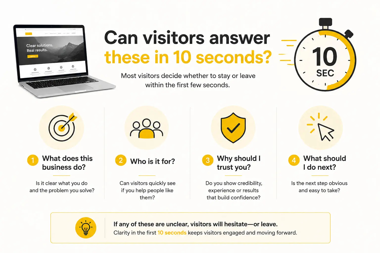
Start With The 10-Second Test
One of the simplest ways to audit your website for clarity is also one of the most revealing.
Open your homepage.
Now try to forget everything you know about your business.
Imagine you’ve never seen the website before.
Imagine you’re a potential customer who has just arrived from a Google search, an AI-generated recommendation, a social media post or a referral from a colleague.
Within ten seconds, could you answer the following questions?
- What does this business do?
- Who is it for?
- Where do they operate?
- Why should I trust them?
- What should I do next?
If the answer to any of those questions isn’t immediately obvious, there may be a clarity issue.
Ten seconds might not sound like very long.
That’s because it isn’t.
Most businesses assume visitors spend far more time evaluating their website than they do.
People are often making decisions before they’ve even started scrolling.
The reality is that most visitors don’t carefully analyse websites.
They scan them.
They look for clues.
They make quick decisions about whether a business appears relevant to their needs.
This isn’t because people are impatient.
It’s because they’re busy.
Think about your own behaviour online.
When you’re looking for a supplier, contractor, consultant or service provider, how many websites do you typically review before deciding which ones deserve further investigation?
Most people don’t spend ten minutes studying every homepage.
They quickly assess whether they’re in the right place and either continue or move on.
One of the most useful exercises during a website clarity audit is to look only at what appears on screen before scrolling.
What can a visitor learn from the headline, supporting text, imagery, navigation and calls to action?
Would somebody unfamiliar with your business understand what you do?
Or would they need to start hunting for answers?
Many websites unintentionally bury important information beneath generic marketing language.
The business knows exactly what it does, so it doesn’t notice that visitors may still be trying to work it out.
The purpose of the ten-second test isn’t to criticise your website.
It’s to identify the gap between what you know and what your visitors know.
That gap is often where clarity issues begin.
Review Your Homepage Headlines
If the ten-second test reveals anything, it’s usually the homepage headline.
This is often the first substantial piece of information a visitor sees.
Unfortunately, it’s also one of the most common sources of confusion.
Many businesses try so hard to sound professional that they accidentally become difficult to understand.
Examples such as:
- Delivering Excellence Since 1998
- Industry-Leading Solutions
- Your Trusted Partner
- Innovative Services for Modern Businesses
aren’t wrong, but they don’t tell visitors very much.
They describe how the business would like to be perceived rather than explaining what the business does.
Imagine walking into a shop and asking what they sell.
If the response was:
“Quality products delivered with excellence.”
you’d probably still have questions.
The same principle applies online.
Visitors don’t arrive looking to decode marketing language.
They arrive looking for answers.
One of the most common things we see during website reviews is businesses describing themselves rather than explaining themselves.
The difference sounds subtle, but it matters.
Consider the following examples:
Describing the business
“We deliver innovative solutions for organisations across multiple sectors.”
Explaining the business
“We help manufacturers reduce energy consumption through variable speed drive solutions.”
The second version may be less grand, but it is significantly clearer.
Clarity helps visitors quickly determine whether your business is relevant to them.
Vagueness forces them to keep searching.
This is where assumptions often creep in.
Because you understand your services so well, broad statements can feel perfectly logical.
You already know what they mean.
Visitors don’t.
One of the simplest homepage audits you can perform is to ask somebody unfamiliar with your business to read your headline and answer a single question:
“What does this company do?”
If they struggle to answer confidently, there is probably an opportunity to improve clarity.
When reviewing your homepage, ask yourself:
- Does the headline explain what we do?
- Does it explain who we help?
- Would a stranger understand it?
- Is it specific enough to differentiate us?
- Are we trying to sound impressive or trying to be understood?
The strongest headlines usually prioritise clarity over cleverness.
Because customers can’t engage with a message they don’t understand.
A useful rule of thumb is this:
If your headline could appear on ten different websites without anyone noticing, it’s probably too vague.
The goal isn’t to sound unique.
The goal is to be understood.
Check Your Service Pages
If your homepage helps visitors understand the business, your service pages should help them understand how you can help them.
This sounds obvious.
Yet service pages are often where clarity starts to unravel.
One reason is that service pages are usually written by people who understand the service exceptionally well.
The better somebody knows a subject, the easier it becomes to accidentally skip important context.
Terms that feel normal internally may be unfamiliar to customers.
Processes that seem obvious may never be explained.
Important assumptions creep into the content without anyone noticing.
Before long, the page makes perfect sense to the business and considerably less sense to the visitor.
Every industry does this.
Engineers do it.
IT companies do it.
Financial advisers do it.
Marketing agencies do it.
Even consumer-facing businesses do it. I was looking at a tile website recently and came across “R11 A+B”. It was probably perfectly clear to the website owner. As a customer, however, I was left wondering whether it was important, and if it was, why nobody had explained it.
The irony is that expertise can sometimes become a communication barrier.
The more knowledgeable somebody becomes, the harder it can be to remember what it’s like not to know.
That’s why service pages are often written for people who already understand the subject rather than the people trying to learn about it.
The terminology itself isn’t the problem.
The problem is assuming that customers use the same language.
During a clarity audit, review each service page and ask:
- What is this service?
- Who is it for?
- What problem does it solve?
- Why would somebody need it?
- What outcome can they expect?
- What should they do next?
If those questions aren’t answered clearly, visitors may struggle to understand the value of the service.
It’s also worth reviewing whether the page focuses too heavily on features rather than outcomes.
For example:
“We provide comprehensive consultancy services.”
may be technically accurate.
But it doesn’t tell visitors why they should care.
Compare it to:
“We help businesses identify opportunities to reduce costs, improve efficiency and make better-informed decisions.”
The second statement connects the service to a real-world outcome.
That’s usually what customers are looking for.
Another useful exercise is to consider how somebody arrived on the page.
Many businesses still imagine customer journeys beginning on the homepage.
In reality, that isn’t always what happens.
Visitors may arrive directly on a service page from:
- Google search results
- AI-generated search experiences (as we discussed in our article AI Users Aren’t Searching in Keywords)
- Social media content
- Shared links
- Industry directories
- Referral websites
In many cases, the service page becomes the first impression.
If somebody landed directly on that page without seeing anything else on your website, would they understand:
- what the service is?
- who it is for?
- why it matters?
- why they should trust you?
- what they should do next?
If not, additional context may be needed.
One of the biggest shifts in customer behaviour over the last decade is that journeys have become far less predictable.
The days of visitors neatly progressing from Homepage → About Us → Services → Contact are largely gone.
People arrive wherever the search takes them.
Which means every service page needs to work harder than it used to.
It isn’t simply a description of a service.
It’s potentially the first touch point a customer has with your business.
Follow The Customer Journey (Not The One You Imagine)
One of the most valuable things you can do during a website clarity audit is stop looking at individual pages and start looking at journeys.
After all, customers don’t experience your website one page at a time.
They experience a journey.
Businesses often think about websites in terms of structure.
Customers think about them in terms of answers.
They don’t particularly care where information lives.
They simply want to find it quickly.
This is why businesses are often surprised when visitors miss information that seems obvious.
The information may exist.
It may even be prominently displayed.
But if it doesn’t appear at the point the customer is looking for it, they may never see it.
This is one of the reasons customer journeys rarely follow the neat paths businesses expect them to.
A useful exercise during a clarity audit is to deliberately start in unusual places.
Open a blog article and see whether you can work out what the business does.
Open a service page and see whether the next step is obvious.
Open the About page and see whether there is a clear route towards making contact.
The easier it is for visitors to move naturally through your website, the less effort they need to expend finding the information they need.
And the less effort they need to expend, the more likely they are to continue.
Because customer journeys rarely fail because people can’t find information.
More often, they fail because finding that information feels harder than it should.
Look For Communication Friction
One of the concepts we discuss regularly at The Last Hurdle is communication friction.
It’s one of the most common causes of website confusion and one of the easiest things to overlook.
Communication friction occurs whenever visitors have to work harder than necessary to understand your message.
Think about it this way.
Imagine asking somebody for directions.
If they explain the route clearly, you’ll probably feel confident about where you’re going.
If they use unfamiliar landmarks, skip important steps and assume knowledge you don’t have, you’ll probably get lost.
The destination hasn’t changed.
The journey has simply become harder.
The same thing happens on websites.
Communication friction can appear in many forms:
- vague language
- industry jargon
- missing information
- conflicting information
- overly complicated explanations
- unclear calls to action
- assumptions about customer knowledge
Individually, these issues may seem relatively small.
Collectively, they can have a significant impact on how visitors experience your website.
One unclear phrase probably won’t stop somebody making contact.
Five unclear phrases might.
One missing piece of information might not matter.
Several missing pieces of information often do.
This is why clarity audits shouldn’t focus solely on major issues.
Sometimes it’s the accumulation of small points of confusion that creates the biggest problems.
A useful question to ask throughout your audit is:
“Where is the customer having to do the work?”
One of the simplest ways to identify communication friction is to look for places where visitors have to interpret rather than understand.
Good communication feels effortless.
Poor communication requires translation.
Are they having to interpret your language?
Are they having to fill in missing context?
Are they having to guess what happens next?
Are they having to connect pieces of information that should already be connected?
Whenever the answer is yes, communication friction may be present.
The goal isn’t to remove every possible question.
Customers will always have questions.
The goal is to remove unnecessary questions.
The ones that exist purely because the website hasn’t communicated clearly enough.
Look For Enquiry Friction
Communication friction affects understanding.
Enquiry friction affects action.
This is what happens when somebody reaches the point where they would like to contact you but encounters unnecessary obstacles.
Interestingly, many businesses spend significant amounts of time and money trying to attract enquiries while unintentionally making it harder for people to submit them.
The visitor has already decided they may want to speak to you.
The hard part has largely been done.
Now the website’s job is to make the next step feel simple.
Unfortunately, this is often where friction appears.
Common examples include:
- long enquiry forms
- unnecessary form fields
- hidden contact information
- multiple contact methods with no guidance
- unclear response expectations
- outdated contact details
- forms that don’t work properly
- generic contact pages that provide little reassurance
Sometimes the issue isn’t technical.
It’s psychological.
Imagine a visitor reaches your contact page.
They complete a lengthy form.
They click submit.
Then they see a generic message saying:
“Thank you for your enquiry.”
What happens next?
Will somebody call?
Will they receive an email?
Will it take an hour?
A day?
A week?
The uncertainty creates friction.
Small pieces of reassurance can often make a significant difference.
For example:
“We’ll review your enquiry and respond within one working day.”
Simple.
Clear.
Reassuring.
Another useful exercise during a clarity audit is to test your own enquiry process.
Complete your contact form.
Call your phone number.
Submit a website enquiry.
See what happens.
Many businesses haven’t experienced their own enquiry journey in years.
As a result, they are often surprised by what they discover.
Because enquiry friction doesn’t just affect conversion rates.
It affects first impressions.
And first impressions don’t end when somebody decides to make contact.
In many cases, they’re only just beginning.
Review Trust Signals
Trust is one of the most important parts of any customer journey.
It’s also one of the most misunderstood.
When people talk about trust signals, they often focus on the elements themselves:
- reviews
- testimonials
- case studies
- accreditations
- awards
- memberships
- client logos
Those things matter.
But the real question is why they matter.
Trust signals aren’t there to decorate a website.
They’re there to answer questions.
Questions that visitors are already asking themselves.
Questions such as:
- Have they done this before?
- Do they understand businesses like mine?
- Are they established?
- Are they credible?
- Can I trust them with my time, money or reputation?
- What do other customers think of them?
Every visitor arrives with some degree of uncertainty.
Trust signals help reduce that uncertainty.
Trust isn’t built in a single moment.
It’s built through a series of small decisions.
A visitor decides to keep reading.
They decide to view another page.
They decide to look at your reviews.
They decide to explore a case study.
By the time they contact you, trust is often already forming.
Most businesses assume trust begins when somebody decides to make contact.
Trust starts much earlier.
It starts when a visitor decides whether to keep reading.
Every review, case study, accreditation and example helps answer a silent question:
“Should I take this business seriously?”
Think about your own behaviour when researching a supplier.
How often do you look for reviews?
How often do you visit an About page?
How often do you look for examples of previous work?
Most of us do it instinctively.
We’re not simply looking for information.
We’re looking for reassurance.
This is where many businesses unintentionally create a gap.
They make claims without providing evidence.
They tell visitors they are experienced.
They tell visitors they are specialists.
They tell visitors they provide excellent service.
But they don’t always show it.
The strongest trust signals provide proof rather than promises.
For example:
Instead of saying you’re experienced, demonstrate your experience.
Instead of saying you’re trusted, show the reviews.
Instead of saying you’ve delivered results, share examples.
Trust becomes much easier when visitors don’t have to take your word for it.
During your website audit, review each page and ask:
“What evidence supports the claims we’re making here?”
You may be surprised by how often important evidence exists but is difficult to find.
A business might have hundreds of positive reviews.
Years of experience.
Excellent case studies.
Strong customer relationships.
Yet none of that is immediately visible to visitors.
Trust signals only help when people can see them.
The goal isn’t to overwhelm visitors with proof.
It’s to provide enough reassurance that they feel confident taking the next step.
Because clarity helps people understand your business.
Trust helps them believe in it.
A website audit shouldn’t stop at the content, messaging and user experience. It’s equally important to understand whether the hosting, monitoring and infrastructure supporting your website are fit for purpose. Read: Your Website Is a Business Asset. Treat Its Hosting Like One.

Test It On Someone Else
One of the most effective website audit tools is also one of the simplest.
Ask somebody who knows nothing about your business to spend ten minutes exploring your website.
Not a colleague.
Not a supplier.
Not somebody who already understands what you do.
Ideally, somebody who represents the kind of person who might one day become a customer.
Then ask them a few simple questions:
- What does the business do?
- Who is it for?
- What stood out?
- Was anything confusing?
- What would you do next?
- Would you contact this business? Why or why not?
The answers are often incredibly revealing.
One of the reasons this exercise works so well is that it exposes assumptions.
Businesses become accustomed to their own messaging.
Customers encounter it for the first time.
What feels obvious internally may not feel obvious externally.
During website reviews, we occasionally hear things such as:
“I thought they did something completely different.”
or
“I wasn’t entirely sure who the service was aimed at.”
Or
“I had no idea you did that!”
The business is often surprised.
After all, they know exactly what they do.
But that’s the point.
The website isn’t being built for people who already know.
It’s being built for people who don’t.
This exercise can also reveal something else.
Not every clarity issue is a content issue.
Sometimes the information exists.
The visitor simply couldn’t find it.
In other words, the problem isn’t what you’re saying.
It’s where you’re saying it.
Or how easy it is to discover.
Fresh eyes often uncover issues that analytics never will.
Because data can tell you where people leave.
It rarely tells you why.
Sometimes the fastest route to improving clarity is simply listening to somebody experiencing your website for the first time.

The Biggest Warning Signs
Not every website clarity problem is obvious.
In fact, many businesses live with them for years without realising.
That’s because clarity issues often show up indirectly.
The symptoms appear elsewhere.
That’s why clarity problems are often misdiagnosed.
What looks like a marketing problem might be an understanding problem.
Businesses often respond by increasing activity.
More content.
More social media.
More advertising.
More SEO.
But if the underlying issue is understanding rather than visibility, all that extra activity may simply drive more people towards the same points of confusion.
One of the most common examples is the business that believes it has a visibility problem.
Traffic is lower than expected (algorithms need to understand your website too).
Enquiries have slowed.
Growth feels harder than it should.
Naturally, attention turns towards SEO, advertising or social media.
But sometimes the issue isn’t attracting visitors.
It’s helping visitors understand what they’re seeing once they arrive.
There are usually clues.
Clarity issues often reveal themselves through patterns.
Prospects ask the same questions.
Enquiries arrive from people who aren’t a good fit.
Team members repeatedly explain the same things.
Customers seem confused about services, processes or next steps.
None of these issues automatically indicate a clarity problem.
But when several appear together, it’s worth investigating whether the website is answering the questions visitors have.
Another useful question to ask is:
“What do we explain repeatedly during sales conversations that should already be clear on the website?”
The answer can be incredibly revealing.
If your team repeatedly finds itself explaining:
- what the business does
- who a service is for
- how a process works
- what happens after an enquiry
there is a strong possibility that the website isn’t communicating those things clearly enough.
One of the reasons clarity issues persist is that businesses become accustomed to compensating for them.
Sales teams explain.
Customer service teams clarify.
Account managers provide context.
The business adapts.
The website never does.
A clarity audit helps identify those hidden gaps before they become normalised.
Because the longer confusion exists, the easier it becomes to mistake it for something else.
Sometimes the issue isn’t that people can’t find you.
It’s that they don’t fully understand you when they do.
Why Clarity Matters
By this point, you may be wondering:
“If people can still find the information eventually, does clarity really matter that much?”
In our experience, yes.
Because clarity influences almost every stage of the customer journey.
It influences whether visitors stay or leave.
It influences whether they trust you.
It influences whether they understand your services.
And ultimately, it influences whether they decide to make contact.
But customers aren’t the only audience trying to understand your website.
Search engines are too.
Increasingly, AI platforms are as well.
As businesses adapt to these changes, some have questioned whether AI systems should be allowed to access their websites at all.
Whether somebody is searching through Google, asking an AI assistant for recommendations or using an AI-powered search experience, those systems are trying to answer many of the same questions as your visitors.
What does this business do?
Who does it help?
What services does it provide?
Where does it operate?
The clearer your website is, the easier it becomes for both people and platforms to understand your content.
Clarity doesn’t replace SEO or AEO.
It supports them.
If you’re unfamiliar with AEO, we’ve explored why it is becoming increasingly important as AI-powered search continues to evolve.
After all, it’s difficult for search engines and AI systems to confidently recommend a business if the website itself isn’t communicating clearly.
Clarity also affects something that businesses don’t always measure particularly well: enquiry quality.
Most businesses focus on the number of enquiries they receive.
That’s understandable.
But quantity is only part of the picture.
Are enquiries aligned with the services you provide?
Do prospects understand what they’re contacting you about?
Are conversations starting in the right place?
A website that communicates clearly often attracts fewer unsuitable enquiries because visitors are able to self-qualify before making contact.
And then there is the biggest unknown of all.
We can see the enquiries that arrive.
We can usually identify the enquiries that aren’t a good fit.
What we can’t easily measure are the people who never make contact in the first place.
The visitors who leave with unanswered questions.
The prospects who weren’t quite sure whether the service was right for them.
The potential customers who moved on because they couldn’t quickly find the certainty they were looking for.
Those opportunities rarely appear in reports or analytics.
But they still matter.
That’s why clarity matters.
Not because it makes a website look better.
But because it helps people, search engines and AI systems understand your business more easily.
And when understanding improves, everything else becomes easier too.
The Last Word
A website clarity audit isn’t really about headlines, menus or individual pages.
It’s about understanding how customers experience your business online.
It’s about stepping back from the familiarity that naturally develops over time and looking at your website through fresh eyes.
It’s about identifying the assumptions that have become invisible.
The unanswered questions.
The points of confusion.
The places where visitors are being asked to do more work than they should have to.
Most businesses don’t intentionally create communication friction.
Most don’t intentionally create confusion.
In fact, many website clarity issues emerge for entirely understandable reasons.
Services evolve.
Businesses grow.
New pages are added.
Different people contribute content over time.
What begins as a clear message can gradually become more complicated.
That’s why clarity isn’t something you achieve once and forget about.
It’s something that needs occasional review.
The businesses that communicate most clearly are rarely the businesses with the cleverest marketing.
They’re usually the businesses that make it easiest for customers to understand them.
Because clarity isn’t about sounding impressive.
It’s about being understood.
And being understood is often the first step towards being trusted.
When businesses improve clarity, they frequently discover something surprising.
Many of the issues they believed were marketing problems were actually understanding problems.
The traffic wasn’t necessarily the issue.
The enquiries weren’t necessarily the issue.
The problem was that potential customers were encountering unnecessary hurdles before they ever reached those stages.
Remove those hurdles and everything else becomes easier.
Because every customer journey starts with understanding.
And understanding starts with clarity.
Most businesses don’t need customers to understand everything.
They simply need them to understand enough to take the next step.
That’s what clarity really does.
It removes the last hurdles between curiosity and conversation.
Not Sure How Clear Your Website Is?
One of the biggest challenges with website clarity is that it’s often hardest to see from the inside.
The people closest to the business are usually the people most familiar with it.
At The Last Hurdle, we review websites from a customer perspective, identifying communication friction, visibility issues and opportunities to improve clarity throughout the customer journey.
Sometimes the hardest thing to spot is the thing you’ve stopped noticing.
That’s why a fresh perspective can be so valuable.
If you’d like an independent view of how clearly your website communicates, get in touch to discuss a Website Health Audit or Marketing Clarity Audit.
Because sometimes the biggest improvements don’t come from attracting more visitors.
They come from helping the visitors you already have understand your business more clearly.
Frequently Asked Questions About Website Clarity Audits
What is a website clarity audit?
A website clarity audit is a review of how easily visitors can understand your business online.
Rather than focusing on technical performance, it looks at how clearly your website explains what you do, who you help, why customers should trust you and what they should do next.
The goal is to identify points of confusion, communication friction and missed opportunities that may be affecting enquiries.
Why is website clarity important?
Website clarity is important because visitors make decisions quickly.
If people struggle to understand what your business does or whether it’s relevant to them, they are more likely to leave without making contact.
Clear websites reduce uncertainty, build trust and make it easier for customers to take the next step.
Can poor website clarity affect enquiries?
Yes.
In many cases, poor clarity affects enquiries long before technical issues become a problem.
Visitors may leave because they don’t fully understand a service, can’t find important information or aren’t confident about what will happen next.
The result is often fewer enquiries, lower quality enquiries or missed opportunities.
What causes website confusion?
Some of the most common causes include:
- vague messaging
- industry jargon
- missing information
- unclear navigation
- weak calls to action
- inconsistent content
- assumptions about customer knowledge
Many of these issues develop naturally as businesses become more familiar with their own services and terminology.
How often should you review your website?
There isn’t a fixed rule.
However, it’s sensible to review your website whenever:
- services change
- customer needs evolve
- new content is added
- enquiry volumes change
- customer feedback highlights recurring questions
Many businesses review their website from a technical perspective but rarely review it from a customer perspective.
Both are important.
Is website clarity different from SEO?
Yes.
SEO helps search engines understand and discover your content.
Website clarity helps people understand your business once they arrive.
The two work best together.
There’s little value attracting more visitors if those visitors struggle to understand what they’re seeing.
Part of the Marketing Clarity Series
This article is part of the Marketing Clarity series from The Last Hurdle, exploring the principles behind marketing that works.
Because before customers can buy from you, contact you or trust you, they first need to understand you.